





Your Custom Text Here
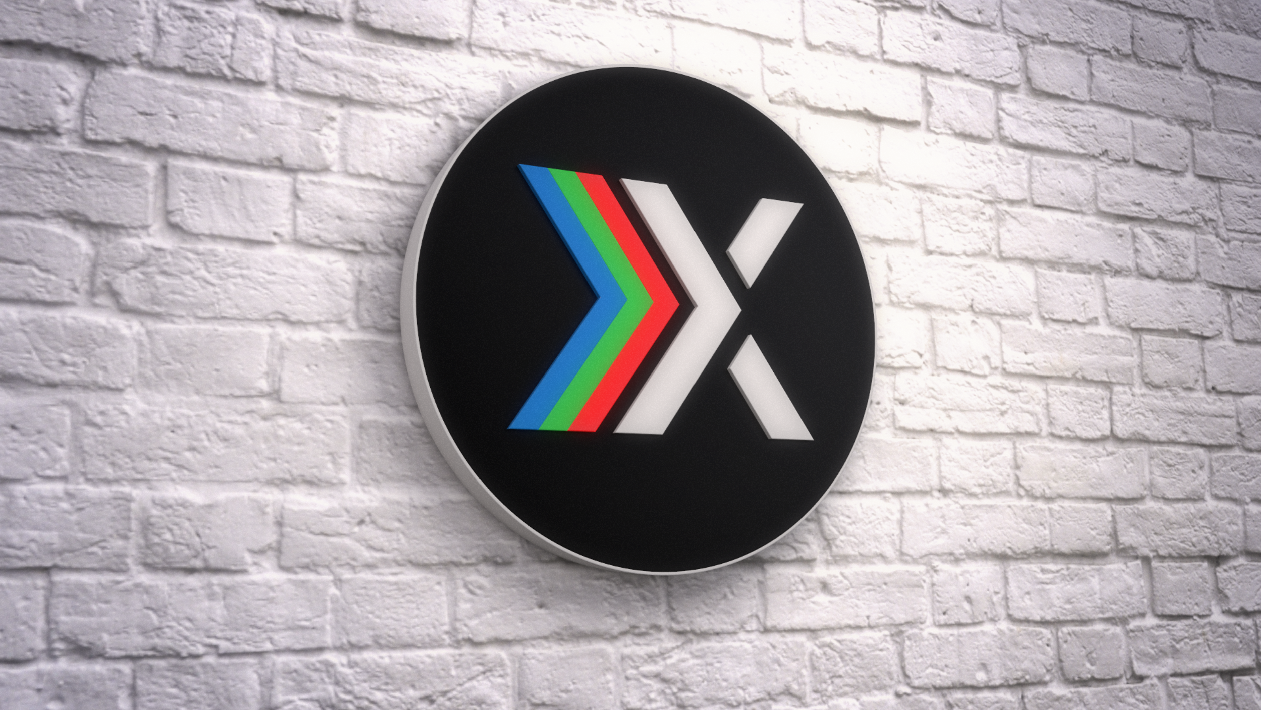
Alkemy X exists in a digital space but has its roots in broadcast. Those two spaces have something in common: Red, Green and Blue, or RGB. I wanted to express that in logo. RGB is an additive process, meaning you can combine those colors to make any other color. Taking a nod from the alchemists, combining these colors changes or transforms them into something else.
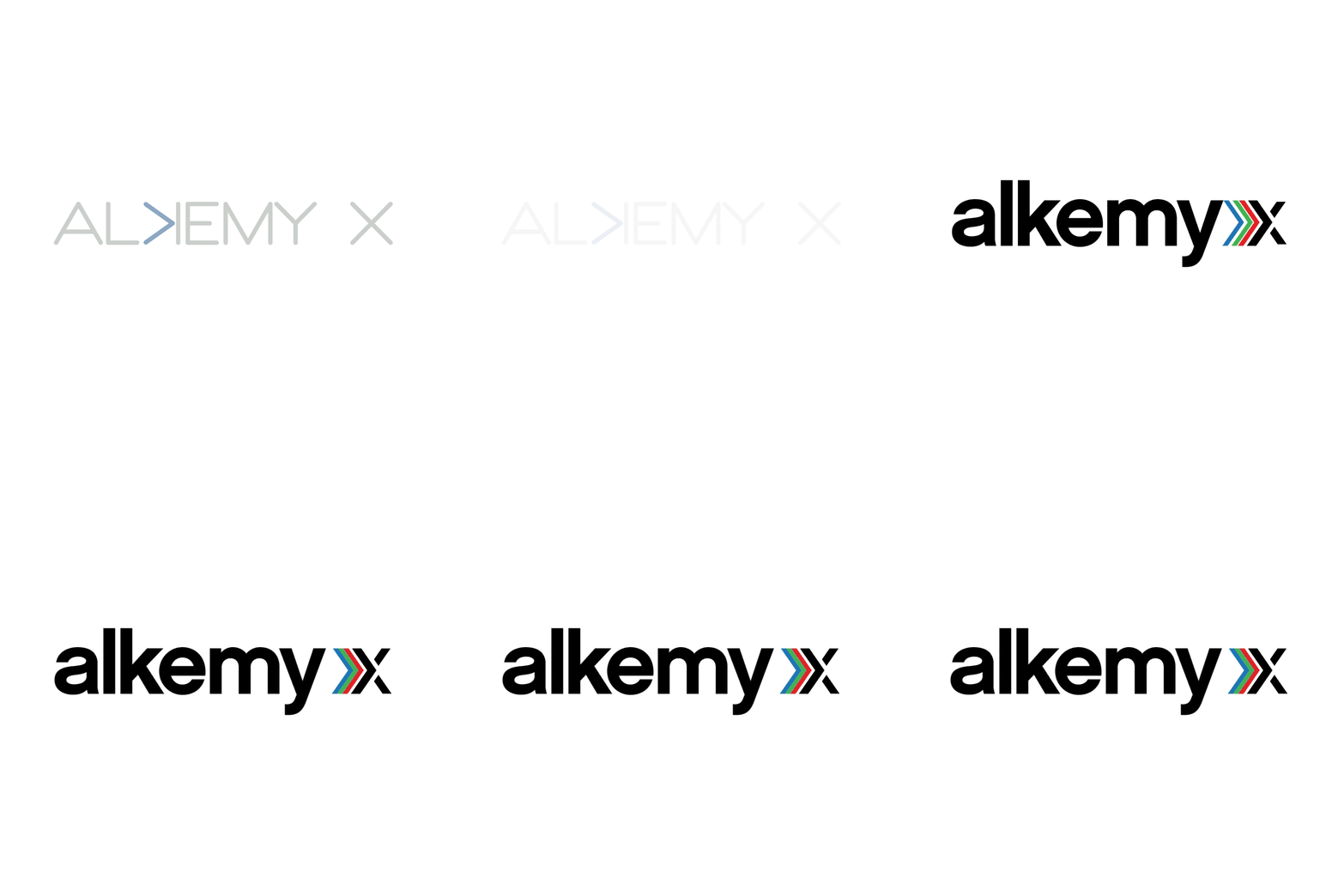
Also, I wanted alkemy’s logo to reflect the company’s long history. I accomplished that with a subtle, vintage feel. It would be at home on the side of a camera or a piece of sound equipment back when the three founders started the company 37 years ago.
The “x” is treated with RGB but uses a piece of the “x” to make 4 arrows. The font of the logo and colors have a throwback feel representing the company’s past but the arrows made up in the “x” represent moving forward and their future.
2018 ADCP Louix Award - Logo Design (Corporate)
Design - Mike T Mullen
Alkemy X exists in a digital space but has its roots in broadcast. Those two spaces have something in common: Red, Green and Blue, or RGB. I wanted to express that in logo. RGB is an additive process, meaning you can combine those colors to make any other color. Taking a nod from the alchemists, combining these colors changes or transforms them into something else.
Also, I wanted alkemy’s logo to reflect the company’s long history. I accomplished that with a subtle, vintage feel. It would be at home on the side of a camera or a piece of sound equipment back when the three founders started the company 37 years ago.
The “x” is treated with RGB but uses a piece of the “x” to make 4 arrows. The font of the logo and colors have a throwback feel representing the company’s past but the arrows made up in the “x” represent moving forward and their future.
2018 ADCP Louix Award - Logo Design (Corporate)
Design - Mike T Mullen
Quisque iaculis facilisis lacinia. Mauris euismod pellentesque tellus sit amet mollis.